

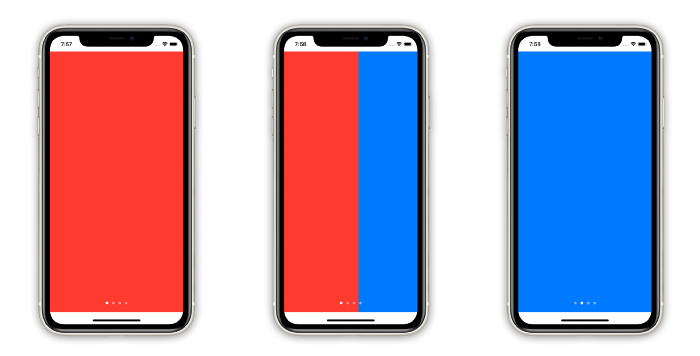
SwiftUI 2 introduced a new TabView style called PageTabViewStyle that enables developers to easily create horizontal Pagers (aka Paging) with dots at the bottom to show users where they are. This is the equivalent of UIPageViewController from UIKit.
Today, we will cover how to use the new style for TabView and how to create a custom IndexView component.


Collection of animations
Getting Started
Using the new API is as simple as setting the new PageTabViewStyle:
struct ContentView: View {

  // MARK: - Private Properties

  @State private var currentIndex = 0
  private let colors: [Color] = [.red, .blue, .green, .yellow]

  // MARK: - Body

  var body: some View {
    TabView(selection: $currentIndex) {
      ForEach(0..<colors.count, id: \.self) { index in
        colors[index]
          .tag(index)
      }
    }
    .tabViewStyle(PageTabViewStyle(indexDisplayMode: .always))
  }
}
Here, I have an array of colors — with each color being a page — and I am also tagging every Color view with its desired index. The TabView initializer has a selection binding that represents the current page.

Collection of animations
A couple of things to keep in mind:
- The paging dots are white and translucent. Therefore, if your background is also white, you won’t see them (tested on iOS/Xcode Beta 3).
- The contents of the
TabViewcannot be drawn over the safe area insets (Tested on iOS/Xcode Beta 3).
Creating a Custom IndexView
Now that we have the basics covered, we can quickly create any custom component to represent the current page and update it accordingly with our currentIndex state property.
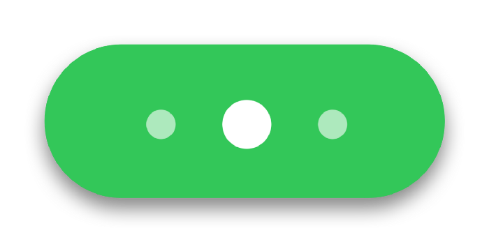
We are going to take a stab at making a more dynamic version of the system dots. This index component will present at most three dots and animate the insertion/removal as you swipe through the pages.

struct Fancy3DotsIndexView: View {

  // MARK: - Public Properties

  let numberOfPages: Int
  let currentIndex: Int


  // MARK: - Drawing Constants

  private let circleSize: CGFloat = 16
  private let circleSpacing: CGFloat = 12

  private let primaryColor = Color.white
  private let secondaryColor = Color.white.opacity(0.6)

  private let smallScale: CGFloat = 0.6


  // MARK: - Body

  var body: some View {
    HStack(spacing: circleSpacing) {
      ForEach(0..<numberOfPages) { index in // 1
        if shouldShowIndex(index) {
          Circle()
            .fill(currentIndex == index ? primaryColor : secondaryColor) // 2
            .scaleEffect(currentIndex == index ? 1 : smallScale)

            .frame(width: circleSize, height: circleSize)

            .transition(AnyTransition.opacity.combined(with: .scale)) // 3

            .id(index) // 4
        }
      }
    }
  }


  // MARK: - Private Methods

  func shouldShowIndex(_ index: Int) -> Bool {
    ((currentIndex - 1)...(currentIndex + 1)).contains(index)
  }
}
That’s quite a bit of code, so let’s go through it step by step:
ForEachandshouldShowIndex()— Display only three dots or less (for the current page and its adjacent pages)..fill()and.scale()— Apply different styling to showcase whichCircleis focused..transition()— Animate the insertion and removal of eachCirclewith opacity and scale..id(index)— Create uniqueCircleinstances for each index.
Final Step
Now we just need to update ContentView to make use of the new Fancy3DotsIndexView:
- Add an implicit animation for every change that happens to the
currentIndexbinding. - Overlay the new
IndexViewcomponent and plug in the necessary properties.
struct ContentView: View {

  // ...

  var body: some View {
    TabView(selection: $currentIndex.animation()) { // 1
      ForEach(0..<colors.count, id: \.self) { index in
        colors[index]
          .tag(index)
      }
    }
    .tabViewStyle(PageTabViewStyle(indexDisplayMode: .always))
    .overlay(Fancy3DotsIndexView(numberOfPages: colors.count, currentIndex: currentIndex)) // 2
  }
}
Voilà!


Final product
Conclusion
Making animations in SwiftUI was already insanely easy, and now with the new TabView style, you can create any kind of index view! Stay tuned for my upcoming articles!
If you are feeling brave enough, I encourage you to try to make your own animations!