
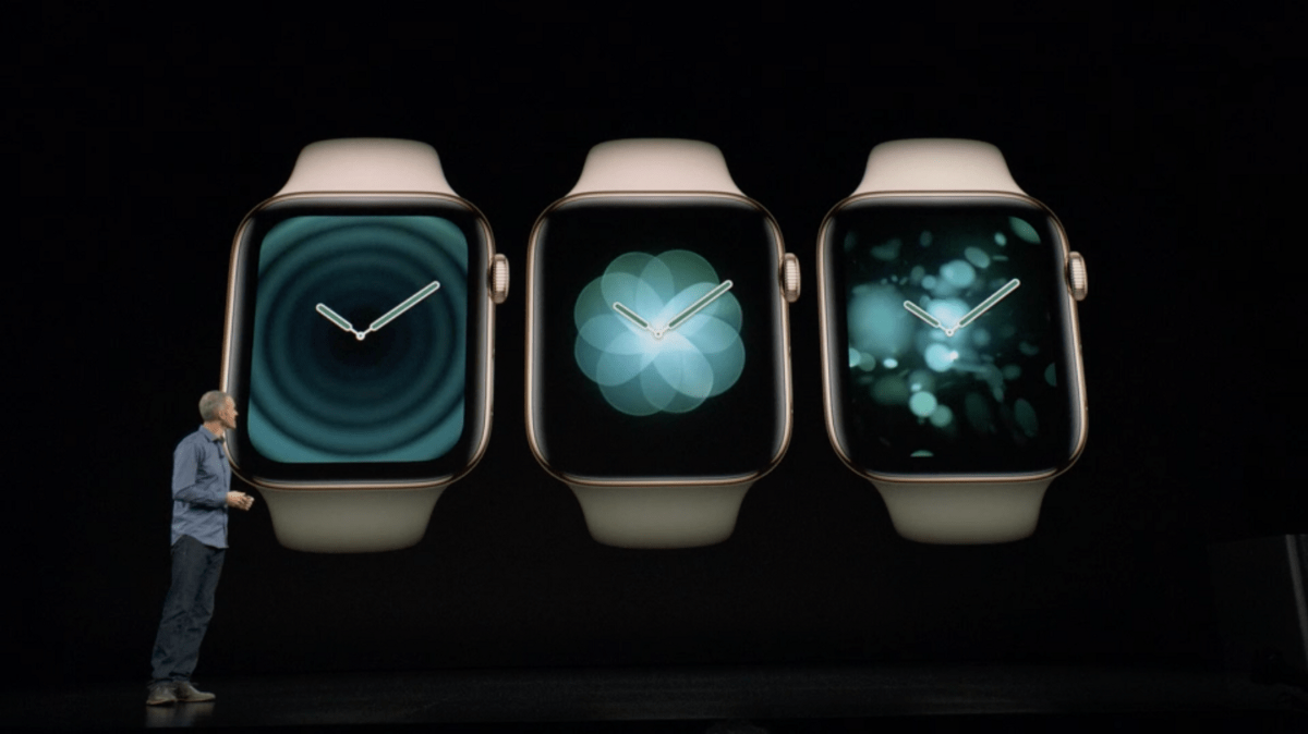
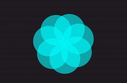
You may have seen and played around with the breathing app from the Apple watch. This features a series of effects and transitions that result in a stunning experience.

Today, we are going to recreate this using SwiftUI’s basic modifiers in just under 100 lines of code!
We’ll be breaking down the UI into the following:
FlowerView: a reusable component that creates the flower and handles all the animation logic- iOS
ContentView: a control room for manipulating the states of theFlowerView.
Note: Make sure you are using Dark Mode when testing because that is the environment where the animation is going to look most stunning.
Creating FlowerView
Let’s start off by creating a new SwiftUI Xcode project along with a view called FlowerView and add all of the necessary properties:
isMinimized: a boolean value that keeps track of the animation’s statenumberOfPetals: this variable is a Double in order to animate the addition/removal of petalsanimationDurationcircleDiameter: represents the size of each petalabsolutePetalAngle: the circle circumference divided by the number of petals results in the absolute angle each petal will be rotated
You will also need to update FlowerView_Previews and initialize your binding properties with constants for now.
struct FlowerView: View {
  @Binding var isMinimized: Bool
  @Binding var numberOfPetals: Double

  /// The duration of any animation performed to the flower.
  @Binding var animationDuration: Double

  /// The diameter of each petal.
  let circleDiameter: CGFloat = 80

  /// The color of each petal. It is recommended to also use opacity to create an overlap effect.
  var color = Color(UIColor.cyan).opacity(0.6)

  /// This represents the absolute amount of rotation needed for each petal
  private var absolutePetalAngle: Double {
    return 360 / numberOfPetals
  }

  var body: some View {
    Text("Hello, World!")
  }
}

struct FlowerView_Previews: PreviewProvider {
  static var previews: some View {
    FlowerView(
      isMinimized: .constant(false),
      numberOfPetals: .constant(5),
      animationDuration: .constant(4.2)
    )
  }
}
Onwards to the body!

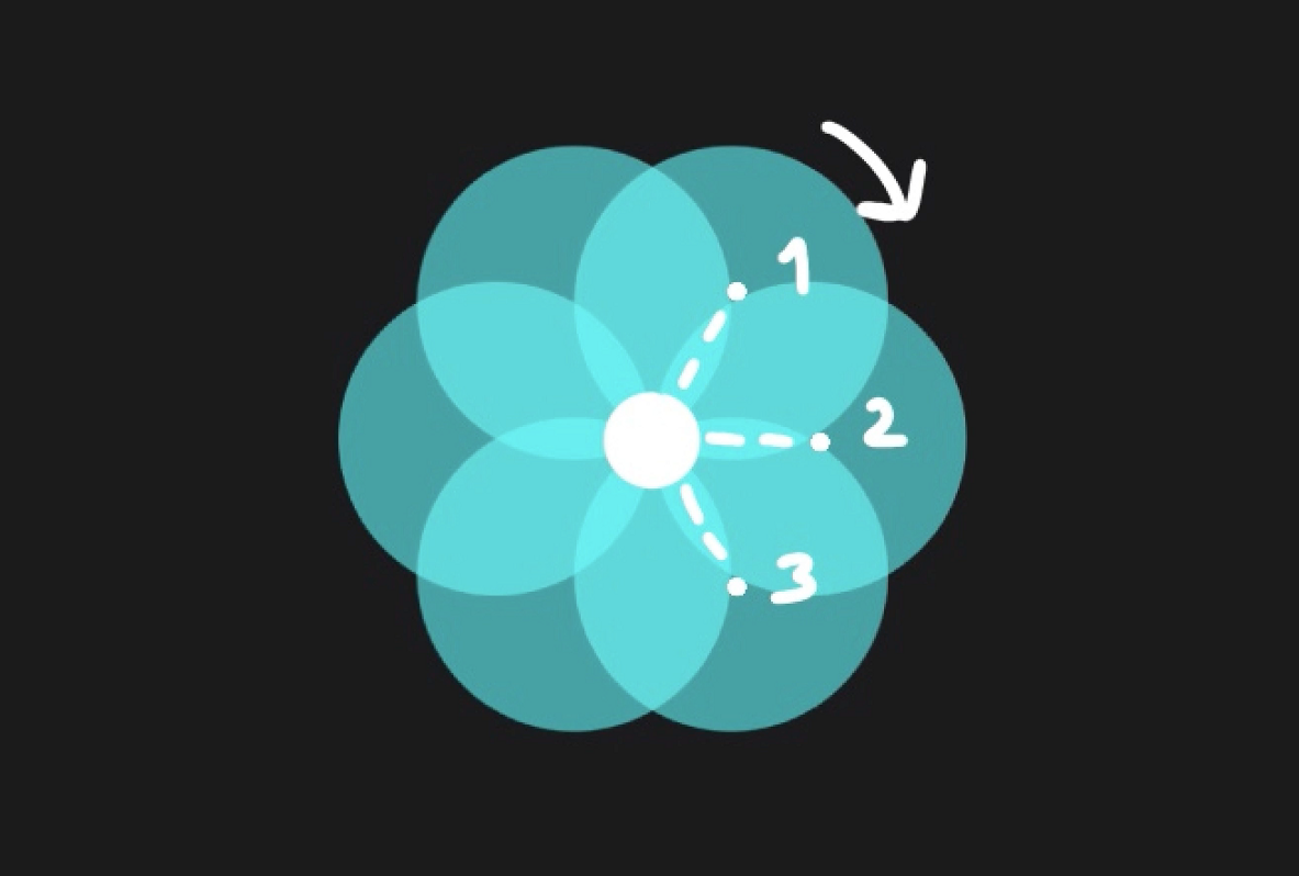
The flower is made by adding multiple circles that rotate and intersect around the center point of the flower. We will create this by adding an array of circles with the help of ForEach and embed it in a ZStack.
The magic part is that we are going to use the .rotationEffect() modifier and rotate the circle around it’s leading anchor, which is the center of the flower.
The anchor point is the part of the view that should be fixed in place as the center of the rotation.
var body: some View {
  ZStack() {
    ForEach(0..<Int(numberOfPetals), id: \.self) {
      Circle()
        .frame(width: self.circleDiameter, height: self.circleDiameter)
        .foregroundColor(self.color)

        // The color of the petal. It is recommended to also use opacity to create an overlap effect.
        .foregroundColor(Color(UIColor.cyan).opacity(0.6))

        // Rotate the petal around it's leading anchor to create the flower
        .rotationEffect(.degrees(self.absolutePetalAngle * Double($0)),
                        anchor: .leading)
    }
  }
  // Center the view along the center of the Flower
  .offset(x: isMinimized ? 0 : circleDiameter / 2)

  // create a frame around the flower,
  // helful for adding padding around the whole flower
  .frame(width: circleDiameter * 2, height: circleDiameter * 2)

  // smoothly animate any change to the Flower
  .animation(.easeInOut(duration: animationDuration))

  // This modifiers are optional
  // The purpose of the code bellow is to align the orientation to perfectly match Apple's implementation
  .rotationEffect(.degrees(-60))
  .rotation3DEffect(.degrees(180), axis: (x: 0, y: 1, z: 0))
}

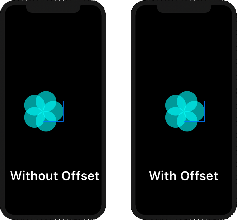
Now we need to .offset() the ZStack by the radius of the circle since we want to center the view based on the center of the flower and not the center of our initial circle.
Before we move on, you will also need to add the .animation() modifier to make our views animated whenever we change a binding property.
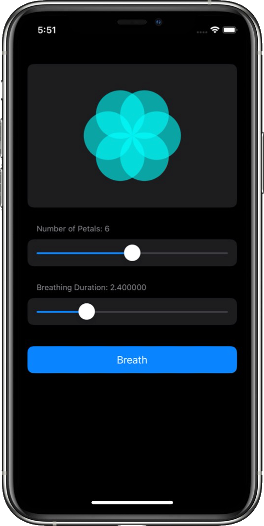
Update ContentView
Now we will work on the screen that lets us manipulate the flower properties and toggle the animation state. For the sake of simplicity and looks we are going to create a list and sections for each of our views:
FlowerView- Slider for changing
numberOfPetals - Slider for changing the
breathingDuration - Button for triggering the animation
struct ContentView: View {
  @State private var numberOfPetals: Double = 5
  @State private var isMinimized = false
  @State private var animationDuration = 0.5

  /// Duration of the breathing animation
  @State private var breathDuration = 4.2

  var body: some View {
    List {
      // Flower
      Section {
        FlowerView(
          isMinimized: $isMinimized,
          numberOfPetals: $numberOfPetals,
          animationDuration: $animationDuration
        )

        // align the flower nicely
        .frame(maxWidth: .infinity)
        .padding(.vertical, 32)
      }

      // Number of Petals
      Section(header: Text("Number of Petals: \(Int(numberOfPetals))")) {
        Slider(value: $numberOfPetals, in: 2...10) { onEditingChanged in
          // detect when interaction with the slider is done and engage snapping to the closest petal
          if !onEditingChanged {
            self.numberOfPetals = self.numberOfPetals.rounded()
          }
        }
      }

      // Breathing Duration
      Section(header: Text("Breathing Duration: \(breathDuration)")) {
        Slider(value: $breathDuration, in: 0...10, step: 0.1)
      }

      // Breath Button
      Section {
        // ...
      }
    }

    // making the list look nice :]
    .listStyle(GroupedListStyle())
    .environment(\.horizontalSizeClass, .regular)
  }
}
The first slider, for manipulating numberOfPetals, checks the onEditingChanged property and detects when the user finished dragging the slider. This allows us to .round() the numberOfPetals, so we never end up with 2.5 petals or something similar.
Regarding the button, my implementation is a bit finicky and consists of DispatchQueues. The reason behind this is to immediately toggle isMinimized after the flower finishes shrinking, making it expand back up.
Feel free to create your own implementation; omitting the DispatchQueue is perfectly fine.
// Breath Button
Section {
  Button(action: {
    self.animationDuration = self.breathDuration
    self.isMinimized.toggle()

    DispatchQueue.main.asyncAfter(deadline: .now() + self.animationDuration) {
      self.isMinimized.toggle()
    }
  }) {
    Text("Breath")
      .frame(maxWidth: .infinity)
  }
}
.buttonStyle(BorderlessButtonStyle())
.foregroundColor(.white)
.listRowBackground(Color(UIColor.systemBlue))

Breathing Animation
What we’ve all been waiting for! This part is a bit more tricky, but don’t worry — SwiftUI makes it a breeze.

We will split up the animation into three parts:
- The rotation of the flower view
- The scale of the flower view
- The rotation of each individual petal
To achieve the first two parts, it’s quite easy. We will use .rotationEffect() and .scaleEffect() modifiers along with ternary operators to change the values depending on the isMinimized state.
Add this above the .animation() modifier from FlowerView.
struct FlowerView: View {
  // ...
  var body: some View {
    // ...
    .rotationEffect(.degrees(isMinimized ? -90 : 0))
    .scaleEffect(isMinimized ? 0.3 : 1)

    // smoothly animate any change to the Flower
    .animation(.easeInOut(duration: animationDuration))

    // ...
  }
}

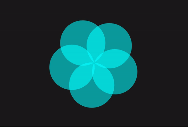
To create the effect of all the petals coming to the center, it is as simple as changing the anchor point to .center from the .rotationEffect() of each petal.
struct FlowerView: View {
  // ...
  var body: some View {
    ZStack() {
      ForEach(0..<Int(numberOfPetals), id: \.self) {
        Circle() // Petal
          // ...
          // rotate the petal around it's leading anchor to create the flower
          .rotationEffect(.degrees(self.absolutePetalAngle * Double($0)),
                          anchor: self.isMinimized ? .center : .leading)
      }
    }
    // ...
  }
}
Voilà!
We have written less than 100 lines of code, and we already have something that looks incredibly similar to our target.


One more thing…
There is one thing we could do to further improve this animation. If you look closely, whenever we add or remove a petal it instantly appears on the screen. Let’s try to fix this.
To quickly solve this issue, we are going to always have on display one extra petal that is ready to animate its opacity. There is a tiny bit of math involved for calculating the alpha based on the petal’s position, but don’t worry, I already have everything figured out for you.
Let’s make these changes to FlowerView. Make sure to modify the range of the ForEach from 0<Int(numberOfPetals) to 0…Int(numberOfPetals).
struct FlowerView: View {
  // ...
  /**
    Calculates the opacity for the petal that is being added/removed.
    This is achieved by calculating the amount of travel in **degrees**
    that the petal needs to travel in order to be completely added
    to the flower and comparing it with the **nextAngle**.
    Afterwards converting this to a 0 to 1 scale.
    */
  private var opacityPercentage: Double {
    let numberOfPetals = self.numberOfPetals.rounded(.down)
    let nextAngle = 360 / (numberOfPetals + 1)
    let currentAbsoluteAngle = 360 / numberOfPetals

    let totalTravel = currentAbsoluteAngle - nextAngle
    let currentProgress = absolutePetalAngle - nextAngle
    let percentage = currentProgress / totalTravel

    return 1 - percentage
  }

  var body: some View {
    ZStack() {
      /**
        Intentionally showing an extra petal by using 0...Count, instead of 0..<Count
        This allows for the following actions:
          - Instantly animate opacity change to the extra petal
          - Snap to the next or current petal
        */
      ForEach(0...Int(numberOfPetals), id: \.self) {
        Circle() // Petal
          //...

          // animate opacity only to the petal being added/removed
          .opacity($0 == Int(self.numberOfPetals) ? self.opacityPercentage : 1)
      }
    }
    // ...
  }
}
Let’s also add to ContentView a dedicated petalDuration property that is intended only for this subtle animation. To make sure this works properly, you will need to dynamically switch between breathDuration and petalDuration.
struct ContentView: View {
  // ...
  @State private var animationDuration = petalDuration

  /// Duration of addition/removal animation for petals
  static let petalDuration = 0.5

  var body: some View {
    List {
      // ...
      // Breath Button
      Section {
        Button(action: {
          self.animationDuration = self.breathDuration
          self.isMinimized.toggle()

          DispatchQueue.main.asyncAfter(deadline: .now() + self.animationDuration) {
            self.isMinimized.toggle()
          }

          // Add this
          DispatchQueue.main.asyncAfter(deadline: .now() + 2 * self.animationDuration) {
            self.animationDuration = ContentView.petalDuration
          }
        }) // ...
      }
    }
  }
}

Conclusion
I made this project to demonstrate how simple it is to get started with SwiftUI and animations. This crazy amount of power comes from the functional programming paradigm and data bindings that work in perfect harmony to keep your code updated and liquid-smooth!
If you want to go even further with this project, you can check out the second part ↗ of this tutorial, where we explore how to create the bleeding blur effect and talk about view transitions.
If you are only interested in the source code, here’s the GitHub repo ↗.